

What if there were a portfolio know-how that brings offers in once you've built it?
Hi there.
I'm Josh (Hyosig Jo), a marketer who helps customers grow through content 😃
This week, a few job seekers asked me to review their portfolios and cover letters.
The know-how I've been sharing since last year with people preparing to change jobs or land their first one seemed to apply just as well to them, so I decided to write it up as a post.
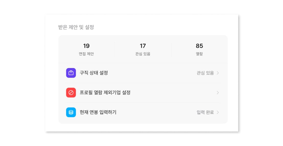
For what it's worth, I used this know-how as a junior and received about 20 interview offers on Wanted and JobPlanet (two of Korea's major job platforms) in a single year.
The two people I helped went on to land an experienced-hire position at HS Ad (a major Korean ad agency) and raise their document-screening pass rate at startups, which convinced me this know-how actually works 😊
A portfolio should be a 'sales proposal.'
The portfolios, cover letters, and career summaries I came across while reviewing mostly shared the same thing to improve.
They were all focused on 'narrative structure': setup, development, twist, and conclusion.
Can you tell why that's something to fix rather than a strength?
After reading all 10 or so pages, I could catch the person's story, results, and growth, but the big disappointment was that it was 'material you have to read.'
There's a saying in copywriting: "If you make them read, you've failed."
Our portfolios shouldn't make busy recruiters read either. They need to be 'visible at a glance.'
The people who asked me for feedback had surely thought about this when building theirs, but this quality needs to be pushed much further.
To put it another way, a portfolio must be a sales proposal, not a product manual.
That means it has to convey your appeal in a short amount of time, and it has to be strictly bottom-line-up-front, not a narrative arc.
Let me walk you through how to actually do that.
You don't need a separate portfolio cover page.
Most portfolio templates floating around the internet have an official-document-style cover page.
And that cover becomes the thumbnail of the first page of your PDF.
From the perspective of saving the recruiter's time, a generic cover and table of contents might as well not exist.
Instead, we can use that real estate much more strategically.
Take the summary page that usually goes around page 3, the one showing your face, key experience, and awards, and use it as your cover, adding a keyword tagline that represents you.
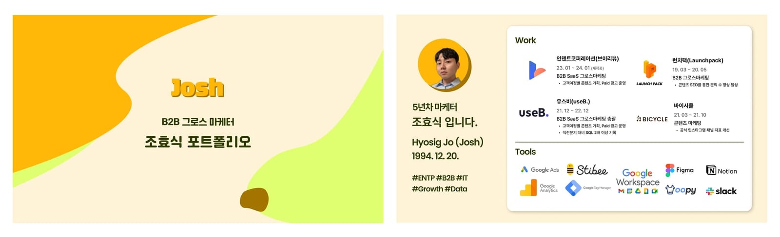
Developing the first page of a marketer portfolio
I believe the first page determines most of a portfolio's results.
The rest of the document only matters if the first page has elements that make the recruiter want to read on.
And the first-page components I introduced above are what do that job.
1) A photo with eye contact
Content with an eye-contact element on the cover sees significantly higher trust and open rates.
That's why human faces appear on Netflix and YouTube thumbnails, education sites, and even milk cartons.
Here, the photo should feel clean and professional, not an AI profile or a playful image, for that trust to come through.
2) A core keyword and intro line that represent you
The very first text a recruiter reads should be copywriting that represents who you are.
Rather than keywords like 'just your name,' 'Portfolio,' or 'Content/Performance Marketer,' go with a format like 'I'm [name], a [type] marketer who [does X].'
In a well-made portfolio, this keyword stays in the reader's head and makes everything that follows more persuasive.
"Marketing is a battle of perceptions, not products."
- The 22 Immutable Laws of Marketing
If you haven't found your strengths or identity yet, I recommend the 'Gallup StrengthsFinder'. It picks the 5 that fit you best out of some 30 strength keywords like Responsibility, Achiever, and Strategic.
Of course, this keyword can change depending on the situation.
When I got a sponsored content deal last May, I used 'B2B content marketer'; when I gave an external lecture earlier this year, I used '5th-year marketer': simple copy that helped readers understand me quickly.
3) Key work experience
Work experience, an important part of both resumes and portfolios, can also be written bottom-line-up-front.
You can simply list it chronologically, but I recommend putting 'what's most relevant' to the position you're applying for first, and then going in chronological order from there.
From the recruiter's side, they can compare your most recent experience against their job posting to judge fit.
4) Education and awards
These lose much of their weight once you're an experienced hire, but for new grads and interns, education and awards can do good work.
If your school or the awarding organization is well known, include the logo; if it's average, I recommend listing it as text.
As for everything else: make what you're confident about stand out, and keep the rest clean and tidy.
5) Tools you can use
Listing tools as 'beginner, intermediate, advanced' was a trend for a while, mostly in Wanted-style Notion portfolios.
I used that approach too, but in the materials I've made recently and the reviews I do, I just tell people to put the logos only.
How well you use a tool is honestly hard to judge objectively, and it doesn't mean much. If you're good with design tools, show it across the whole portfolio.
The same goes for ad platforms, GA, and Python. Real skill shows up in the results pages that follow.
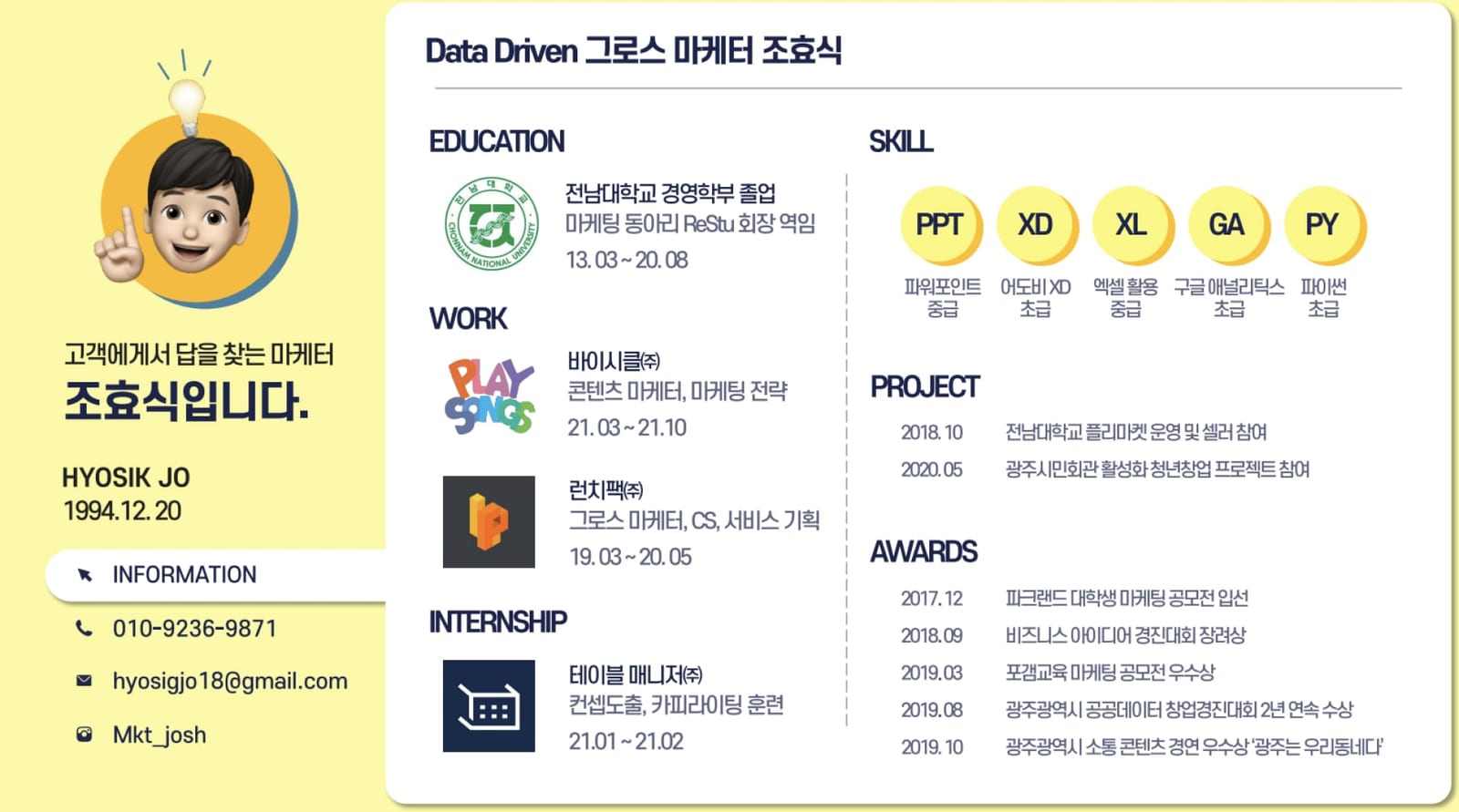
Portfolio results pages: an easy, clear template
If page 1 is well put together, the pages that follow need to amplify the anticipation you've built and remove any doubts.
That's why the three key points are 'put results at the very top,' 'organize by context, not text,' and 'tuck less important info into a corner.'
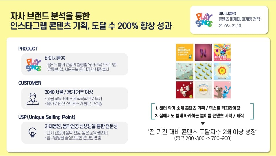
Core information
- What you did and how much of a result it produced
- Who it was for and what you did
- What changed compared with before
Those three are the core pieces of information I need to convey on a results page.
When people look at a document, their eyes move from top left to bottom right on a PC, and from top to bottom on mobile.
Since recruiters review portfolios on a PC, I put the most important information at the top left and arrange things so they end at the bottom right.
It's also important to cut text as much as possible and use icons, flowcharts, and diagrams so the context comes across even without reading.
Finally, less important reference info (duration, level of involvement) goes in the top-right space, so only those who are curious will look at it.
This method works well not only for portfolios but also for actual sales and partnership proposals.
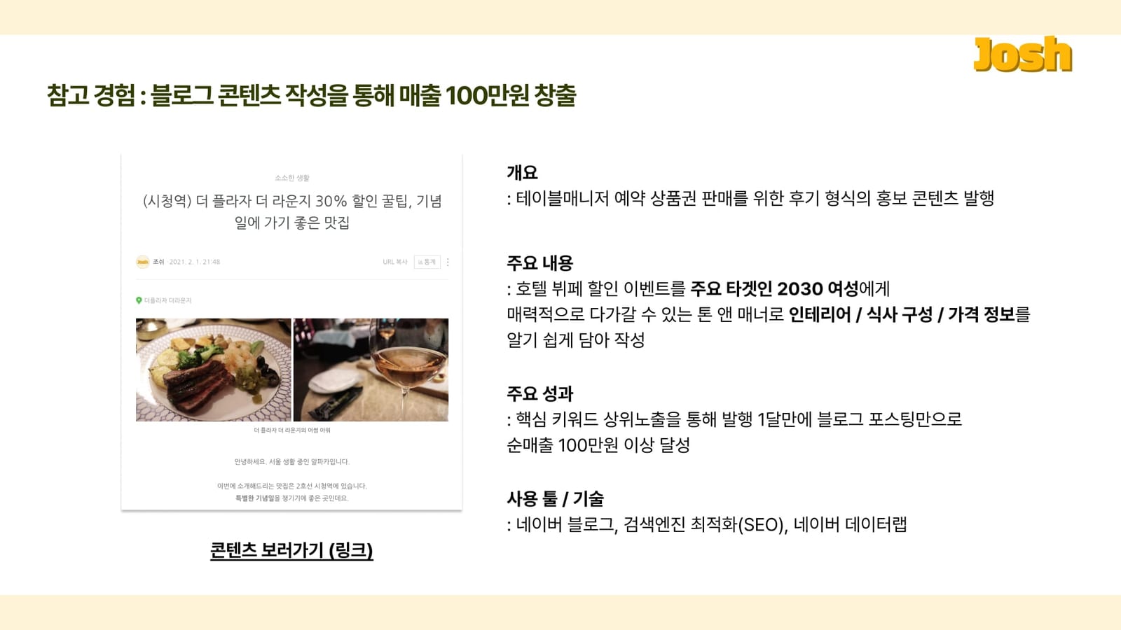
As long as the top-left information is compelling, the rest can be organized reasonably well and people will still want to read it, which is why you can expect good results.
I used the text-heavy one-page portfolio above when I was pitching for a blog content sponsorship.
The single point "I generated 1 million won in revenue with one post" was enough to grab people's attention.
Growing as a marketer: how can we do better? 😃
Want to know how to pick a good company, how to organize your portfolio, and above all, how to manage your career with confidence?
I recommend subscribing to the 'Marketer Haven' blog 😃
In early 2024 I gave feedback on more than 30 marketer portfolios, and we're building up plenty of success stories.
I'll be sharing the know-how I've gained from countless trials and errors in managing my own career. 🔥
And if you're seriously thinking about 'growing as a marketer'?
Check out the program below.
Join 'The Progressive Club,' run by SIDIZ (a Korean office-chair brand), and you'll find exchanges with marketers who grow proactively, along with hints for your own growth.
Just recently, I also had an in-depth discussion about marketing and growth through a program called 'The Marketer's Chair'.
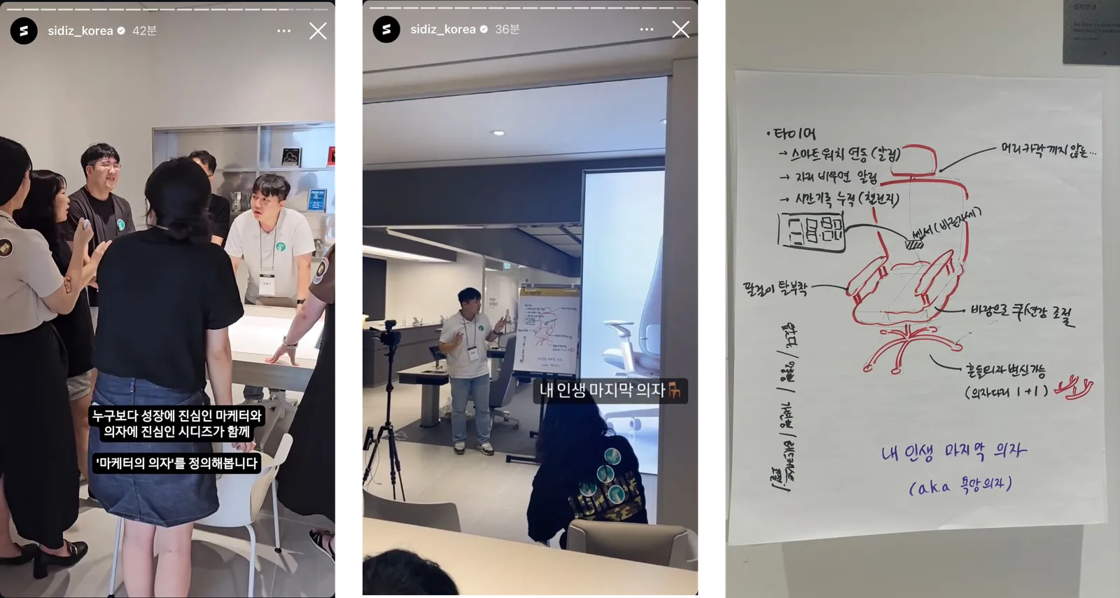
I'll keep coming back with good content that cheers on the growth of junior marketers.
Thank you!


